


Me and Lizzie's Evening of Productivity
Me and Lizzie decided to arrange a photo-shoot in the studio with Maria to get some photos for the digipak and website.

After finally managing to arrange a time, we met at 2:00 and took a load of photos (link to photos).
After finally managing to arrange a time, we met at 2:00 and took a load of photos (link to photos).
 |
| Me and Lizzie at the shoot. |
 |
| The photography studio. |
Evaluation of Focus Group
Below is a recording of the audience test.
The Digipak
The digipak, which I designed had various positive and negative feedback. We showed a paper mock-up of it around the room. The main feedback was that it was not similar enough to the website, which had a lot less colour.
Feedback Snippets:
"I like the colourful writing, I like the big black title of her name. I think maybe the pictures are a bit too much [...] I think it needs to be a bit more subtle, like you've got her eyes on the front, eyes on the back, face all in the middle."
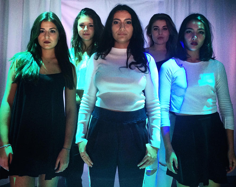 |
| "Maybe have, like, that picture, with the girls behind her." |
"Colourful letters don't go with that (the website)"
"You want a visual thing carried between the two"
"change the images on the digipak but maybe keep the letters.
"The colour(red letters) on the back, I think are a bit much."
"I like coloured letters but they're kind of like more pastel-y colours in a way whereas they're more bold."
Website
It was not made clear as to whether the website should be changed to fit the theme of the digipak or the digipak should be changed to fit the theme of the website. This caused conflict between me and Gabriel, who had designed the website, I hope to try and meet halfway, altering both the website and digipak in order to create a common theme throughout.
Feedback Snippets:
"I think the font could be a bit bigger and a bit more interesting [...] If you're kind of going for that pop vibe then maybe a bit more swirly rather than just the block capitals"
"Not quite so formal"
Video
The video had some positive feedback, mostly about the editing and the attitude. This is useful as we still have time to edit the video in accordance with the feedback. After the test, Gabriel and I went back and worked on the editing.
Feedback Snippets:
"(I liked) The fade in and fade out and the whole thing how the editing fit with the music"
"I thoughts it's the only group out of these few who have matched the, sort of genres together"
What is a Focus Group?
When a company want to test how their product will be received by the
public, they often test it out on a small group of people in a
controlled environment to see what the reaction is likely to be.
Audience testing is important because:
This focus group is very efficiently executed.
This next focus group is rubbish.
- When you have worked on a product which you care about, it is easy to be biased yourself and a fresh perspective can often help to point out flaws which you didn't see yourself.
- You may be making a product designed for an audience which you do not belong to. This means that feedback from members of your target audience are more valuable as they understand the genre better.
This focus group is very efficiently executed.
- The leader of the group was friendly and nice.
- He asked open questions and didn't try to provoke a response.
- He accepted negative criticism.
This next focus group is rubbish.
- They tried to evoke a specific response.
- They ignore criticism and focus on only positive feedback.
- They explained to the audience how they want them to react.
Evaluation of the Shoot Day
 |
| An obligatory on-set selfie. The canteen, our makeup area. |

Firstly, we filmed the runway shot. It had been set up first as it was the most elaborate set and we didn't want to waste time putting it up on the shoot day. I was a bit annoyed at first, that the runway looked like a hospital ward but when we started filming, we saw that it translated differently onto camera. Unlike the thriller shoot last year, the roles were not fixed. The media department took a lot more control this year, leaving us to direct and organize the actors between ourselves.
I would have liked to work with the camera, as that is what I enjoy and feel I am good at, but unfortunately there was not a lot of opportunity to do so. I enjoyed communicating with and directing the actors, as well as the lighting guy - as our video was highly dependent on lighting.

On the subject of lighting, I was a bit annoyed at the lighting in Hannah's rollerskating scenes. It was dark, frantic, annoying and completely distracted from the actual skating itself.
 |
| Carlotta with her boxing gloves. Lizzie helping us focus the camera. |
[pillow fight]
The actresses were all great but my two favorite to work with were undoubtably Phoebe and Romany. Phoebe. Romany had obvious screen presence and was nice and charming to work with even when it was clear that she was tired and bored. Phoebe performed fantastically as was naturally confident in front of the camera.

Overall, I was pleased with the way the shoot went. We got all the shots we wanted, some things didn't turn out quite the way I envisioned them but lots of things turned out better.
The Day Before the shoot
The day before the shoot involved finalizing all arrangements, collecting all props and preparing the sets. We organized a time to construct and paint the white catwalk as shown below. We also emailed the girls, reminding them to bring in their clothes. Despite our frequent request, we hadn't managed to see all of the girl's clothing so we were partly relying on their own judgement.
 |
| Painting the set |
 |
| Plan |
What is a Digipak?
The package that a CD comes in plays a very important role in conveying the image of the artist. It is usually a fold out pack with multiple graphics or images on each side. A digipak makes the packaging a part of the experience of owning a CD, it is more special and interesting than a regular plastic CD case. It also allows the producers to include information about the artist and their identity. Whilst a regular consumer might just download the album from iTunes, a dedicated fan might feel the need to put in that little bit extra money for a physical copy of an iconic part of the artist's history.
There are lots of important conventions that you can find in most digipaks, throughout all genres. Below is Marina and the Diamond's 'The Family Jewels' annotated to show the popular conventions of a digipak.


 |
| A four sided digipak |
 |
| A six sided digipak |
 |
| An eight sided digipak |
There are lots of important conventions that you can find in most digipaks, throughout all genres. Below is Marina and the Diamond's 'The Family Jewels' annotated to show the popular conventions of a digipak.
Our Digipak
We made a start on our own digipaks. At first we created these:
The eye image (see what we did there? I Got my Eye on You?) is taken from an actual picture of a girl's eye (Heidi, who was originally going to be the singer) and edited to look fractured. We went for a bright, fun colour scheme and focused on simplicity. After finishing the regular cover, we decided to make a deluxe edition, which was the same but gold and a different colour scheme:
After looking at more pop digipaks, we noticed that not a lot of them had this kind of colour scheme or imagery. In keeping with the convention, we decided to focus more on what other pop albums had done. Lots of them used photography of the artists, such as Loud by Rhianna, which is almost 100% pictures of Rhianna looking sleepy. We decided to go down that route, arranging a photo shoot with Maria.
 |
"The worst disease which can afflict executives
in their work is not, as popularly supposed,
alcoholism; it's egotism."
- Robert Frost
|
Subscribe to:
Posts (Atom)